PowerBI is the cloud version of Microsoft BI stack. After seeing some awesome things at SPC14 I decided to take a dive into the course material on MVA.
Notes from watching the MVA course on PowerBI
Power Query
Power Query represents the ‘getting data’ part of the stack. It’s available as an Excel 2013 plugin (Download from Microsoft). Over time this will be the way to get data into Excel, replacing the ‘Data’ and Power Pivot ‘Data’ ribbon features.
It has a huge number of available data source connectors:
- From web which can pull in web based data sources
- From file which can pull in from files like csv
- From database which can pull from a wide variety of database systems
- From other sources, basically a collection not matching the above categories such as SharePoint lists, the Azure services, Facebook
This list will continue to grow as the Microsoft team build more and more extensions.
There is a great feature for finding data. The ‘Online Search’ can find published data and queries from across the web (Microsoft maintain a huge collection in their catalogue), from you internal organisations catalogue and from shared queries.
Once a query is configured Power Query does as much as it can to pass the right query to the datasource. So for example if you’re pulling relational data from a DBMS Power Query is passing down the restrictive query to that DBMS to push the query load onto that system. This helps to ensure performance is optimal. Where a user is using flat files then it really can’t be offloaded so the local machine bears the brunt of the performance hit. This would be something to consider when designing solutions. I personally think this intelligence is amazing and could really play well when designing a self service BI solution.
The query can pull the data into either the local Worksheet or into the Data Model. Pulling into the Worksheet is really best employed where the dataset is of the smaller end of the spectrum, pulling into the Data Model is where larger data collections would benefit. Also consider your file size, bringing the data into the model drastically reduces its footprint. They gave an example of a 4Gb file being compressed into about 160mb file. This is important when you consider the maximum file size in PowerBI is 250mb.
Another neat feature is pulling data from a ‘folder’ into one collection. So you can bring together multiple csv files for example in a straight forward fashion.
The query can actually parse things like JSON which opens up possibilities to call data services and simply transform them to tables and related tables.
Power Query Editor
Once you create a new PowerQuery it launches the editor where you can perform loads of neat things on the data.
- Manipulate the columns, like ordering, name, format, using them as headers
- Splitting columns by delimiters etc.
- Filtering
- Removing duplicates
- Merging additional queries into the same sheet, thus merging datasets
- Bringing in just columns you want
- Creating your own dimensions
- Choosing which columns you merge on
- Unpivoting data, as you often get data in a pivoted format as it is generally how it gets presented for reporting
- Formula bar, which allows you to use the query language to create additional data interactions
Data stewardship
Session about examining the problem space, what are the things business is trying to solve?
Information challenges:
- Searching for data takes time, there are lots of useful datasets within an organisation which are often not available to others
- Preparing it for use takes time, it is not always clean or in a sensible format for reuse, lots of redundant processing
- IT spends time trying to service requests, due to the platforms and processes most users have to get IT to do the heavy lifting to create views, reports etc., they also often can’t react in a timeframe the business needs
- IT has to also govern access and data use
- Lack of trust is significant with business user community, because the stewardship of the data is often unknown most users question the validity or authenticity of the data
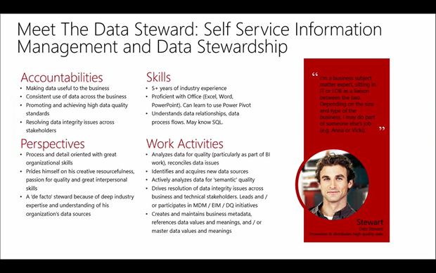
In some organisations the role of ‘Data Steward’ exists. These people tend to have a foot in both end user and IT camps. They tend to have understanding of what IT have provisioned and what the business needs.
Quote from Gartner “… only business users close to the content can evaluate information in its business context”
Data stewards can promote queries into the corporate data catalogue and help the business users understand them.
(note to self – using Yammer groups to help here would be worth looking at)
It’s an interesting viewpoint. Consider a scenario where a dataset is held in an Excel workbook and that gets emailed to another person. At this stage you have now forked the data and it has instantly become less trust worthy and accurate. Now imagine if instead you’d shared the query, now the data remains a single source and thus more trust worthy. In business it’s often the earlier stages of report creating that datasets which could be useful to be shared are created. By looking to share the queries rather than the end product reporting we are enabling more uses of the data building blocks.
The common steps an information worker is taking:
- Identifying the need, what is the problem they are trying to solve
- Identifying the data, what data could help them solve the problem, which domains are they from, who owns them
The ‘Data Steward’
(taken from the MVA slides)
Data Catalogue
This is the way we can promote the data:
- Stores and process the metadata about the data sources available, users and their relationships
- Provides the search functionality
- Connects to the corporate data through the integration layer
It is a set of Office365 services.
Important note, sharing to the catalogue is only sharing the metadata of the query not the queried data itself. So the important thing to realise is the user who executes the query needs to have access to the data still.
Power Query
For Information workers:
- Search for and access relevant data
- Filter and merge data
For Data stewards:
- Define repeatable data queries
- Publish and share and annotate those queries
Data Management Portal
- Manage metadata shared queries and published data sources
- Monitor telemetry, the usages search etc.
- Gain insight on data lineage
Admin Centre
- Govern the data integration layer, admin the on-prem access
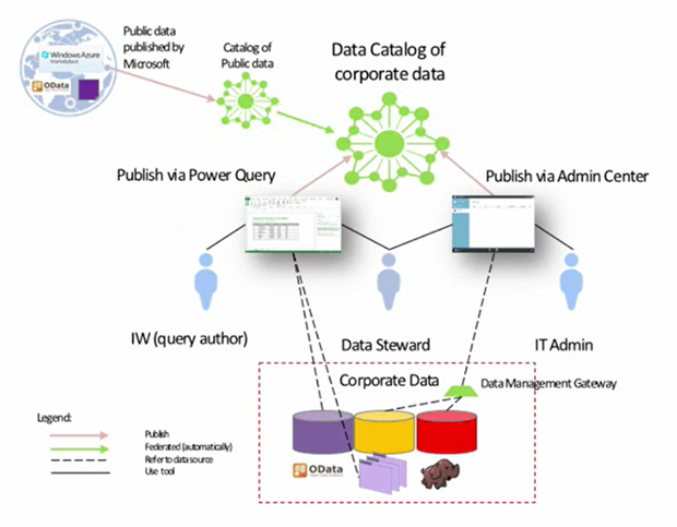
Data Publishing
Diagram taken from MVA session
Shows the multiple ways to publish your data to the data catalogue.
Every Office365 PowerBI tenant gets their own ‘Corporate Data Catalogue’.
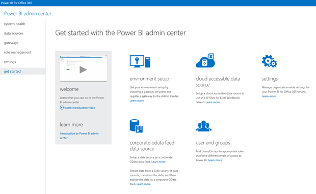
The admin centre in Office365 looks something like this
By default when a user searches they search across both Corporate and the Microsoft public catalogues.
Some of the old drawbacks about documenting data services were that often finding the endpoint service and reading about it were disconnected. This led people to question the investment in the documentation as it was often missed. With PowerBI this descriptive is right there next to the result in PowerQuery making the metadata instantly accessible and therefore valuable.
To get all these capabilities you need to be ‘signed in’ to the PowerQuery via your tenant. Sounds obvious but its very important to factor into the messages during rollout.
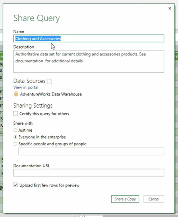
Share Query dialog
So as the Data Steward you can choose to ‘share’ your query from within Power Query once you’re happy with the query configuration.
The example from the session looked like this.
So the shared query has the following:
- Name which is the visible name for that query, here you should be descriptive to help people quickly scan a list for it
- Description, helping further explain the data query, one point to think about is what sort of copy style your organisation needs, it shows up anywhere the query appears
- Data sources, this lists those data sources being used inside this query, this will be important when you consider the data lineage
- Sharing settings, if the user sharing is part of the ‘Data Steward’ role then they can certify the data as officially supported/verified as truth, ‘Share with’ is pretty obvious
- Documentation url, the url to anything which is classed as the documentation, in larger organisations this could be the direct document office online url
- Upload preview rows, does exactly what it says on the tin
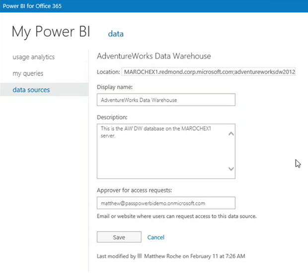
Note that the data sources within the organisation can themselves be annotated to provide friendly information to the user. In the dialog above the ‘view portal’ link goes to the PowerBI admin screen which allows further description to be created for that data source. Notice the contact information to help a user to gain access to this resource.
Some insights from the analytics would allow you to work out the highest utilised queries/data sources and some that show up a lot in search but are rarely used. All this starts to help drive value and returns from the exploration and sharing of corporate data.
Power View
PowerView is the ‘visualise’ element of PowerBI. It is the interactive, data exploration, visualisation and presentation capability. It is based in Excel 2013.
The session scenario:
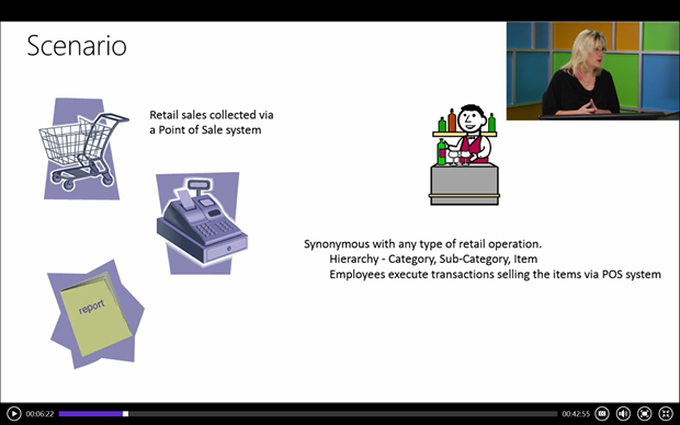
A retailer establishment who’s sales are collected through the POS system and contained in the traditional hierarchy of Category – Sub Category – Item
The role in the scenario is of the ‘Bar Owner’ who has little technical experience but wants to analyse his POS data to create some targeted promotions.
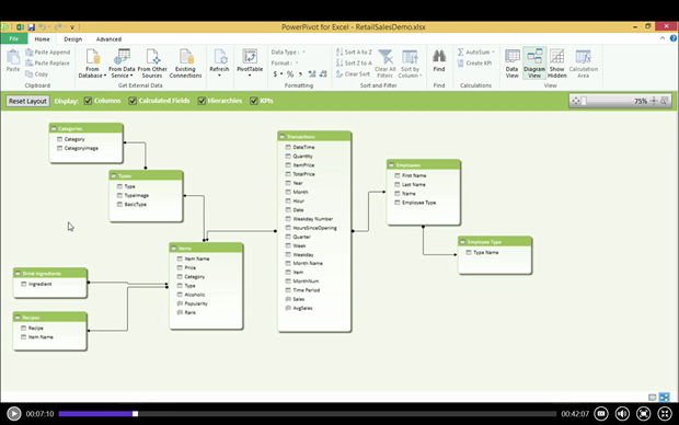
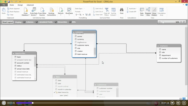
The demo brought in data into a Power Pivot model as below:
The basic step to start is to go into your sheet and from the ‘Insert’ ribbon choose ‘Power View’. The Power View brings in all the available fields and tables from the data model.
Three ways to add fields to the canvas:
- Check the check box in the fields list in the tool pane
- Drag it to the canvas
- Drag it to the ‘Fields’ list in the tool pane
Once you have selected the fields you can change the representation from the ribbon options. Manipulating the display is as easy as selecting the ‘style’ you desire and from the tool pane you can manipulate the fields and filters.
It has some very neat features that when you interact with one of the graphs it will highlight the same data pivots in other graphs in the sheet. This ‘cross highlighting’ works across all the graphs in the view. Even legends are interactive.
Removing the title from individual graphs is done by selecting the graph and from the ‘Layout’ ribbon selecting ‘None’ from the ‘Title’ button.
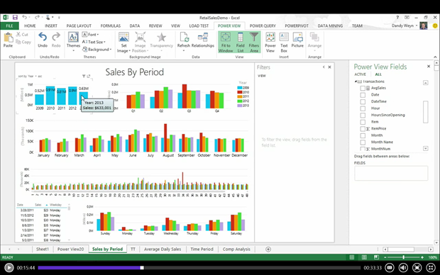
By the end of the report creation it looked like this
If the default colours and design are not to your liking you can change the theme and background from the ribbon.
To add filters to the report, simply drag them from the tool pane list onto the ‘Filters’ section of the report.
Due to the interactivity of the report, a user can really drill down and use the canvas elements to gain insights into their data.
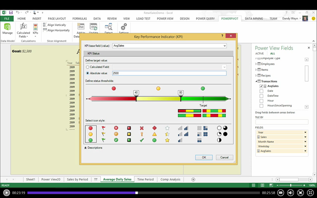
Demo included adding a ‘KPI’ from the PowerPivot ribbon.
Pick the column to base the KPI from and then configure the values and display as you require. Once added it will update the PowerPivot data model and this new field appears in the Power View tool pane for selection (it has a traffic light icon).
Adding a in canvas filter is as simple as dragging the field from the tool pane onto the canvas. It will then add that single column onto the canvas, but we can go a step further and turn it into a ‘Slicer’ from the ribbon. Now when a user selects a value from that column it cross highlights the rest of the canvas.
Demo then showed how to rollup the view using ‘Matrix’ for the main table and enabling the ‘Show levels’ to rollup the data further. To modify which columns get displayed is again done through the tool pane options.
In the tool pane when you drag a single field to the ‘Tile By’ option and it creates tabs which creates a design surface within the tabs. You then set up the graphs within this surface.
Power Map
Power Map is the mapping visualisations for your data.
Different steps to go through to create a Power Map visualisation:
- Map data
- Data in Excel, Power Pivot data model
- Geo-code with Bing
- 3D and 4D visuals
- Discover insights
- Play over time frames
- Annotate anything interesting
- Capture a timeframe as a scene
- Share
- Add effects
- Interactive touring
- Share workbooks
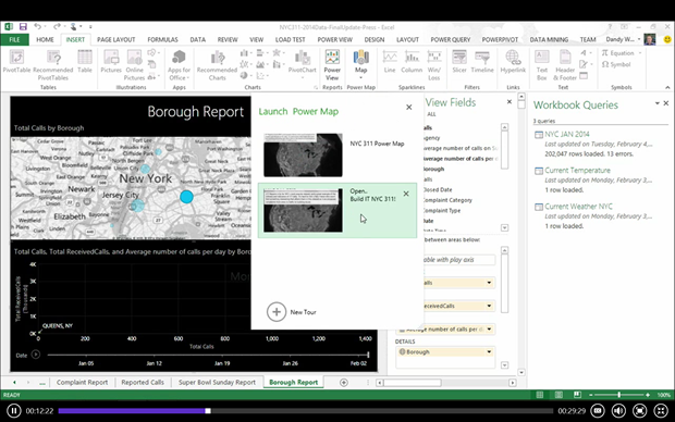
From the ribbon you can choose the ‘Map’ option.
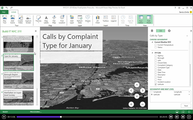
Building a new tour
A tour allows you to present the information and guide the viewer across it.
The left hand side is the scenes, the centre is the scene content and the right hand side is the data.
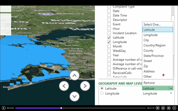
Interesting note is that the ‘other’ column can basically allow you to map anything that the Bing mapping API could map to be used from your data. The example given was airport codes.
Adding more than just text annotation, the example here is a picture
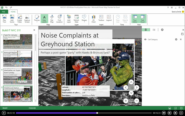
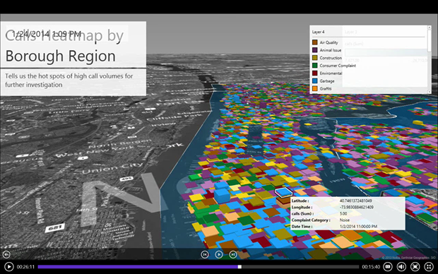
During a tour you can still interact with the map, pause and drill down into the display.
PowerBI and mobile BI
You can add the PowerBI from the app catalogue.
As a note you can default site samples into your PowerBI site to help you get an understanding of some of the features.
To have PowerBI features light up for a specific Excel document it needs to be ‘Enabled’ in the options (part of the tile).
From the PowerBI dashboard clicking the file opens it within the Office Online.
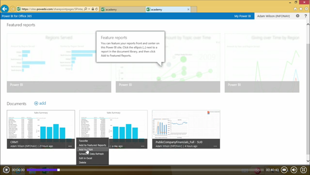
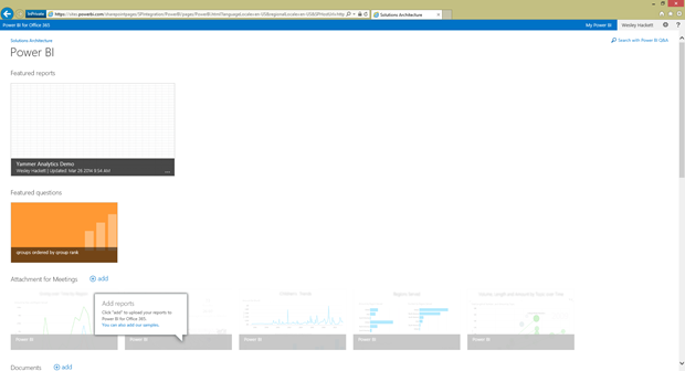
‘Featured Reports’ is an interesting feature as it allows you to promote a report across all the users of your PowerBI capability. This is a simple as clicking ‘Add to featured reports’ from the tile context menu. There are no specified limits to the number of reports that can be set to ‘featured’.
If you don’t want to share a report to everyone but still want a short cut for it you can select ‘Favourite’ from the tile context menu to effectively pin this report as favourite. These are then found in the ‘My Power BI’ in the suitebar menu.
You can also schedule a data refresh from the tile context menu. This will call the data source and invoke a data refresh into the report.
Mobile PowerBI
You can install the Windows 8 app from the store. (Interesting it’s mobile when in fact its the Windows OS ![]() )
)
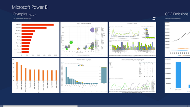
By default it contains the Microsoft sample data. As seen in the screen grab below.
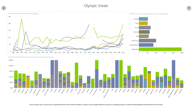
You can then add your own reports by ‘Browse’ from the context bar, select your site and pick up the Excel file containing your report. Tag it as favourite and it’ll show up on the main dashboard. Clicking into the report will then load the same Power View report as you would see in the browser.
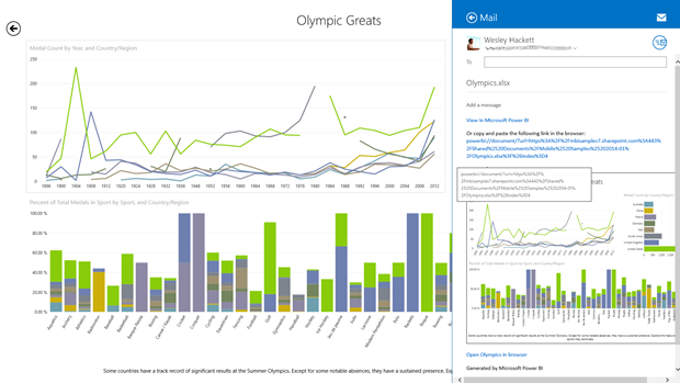
You can also take advantage of the normal ‘Share’ capability from Windows 8. Here I’m choosing to share a report via email.
The thumbnails for the reports are also dynamically updated at intervals to reflect the actual view of the report. So even this adds a ‘peek’ style to the dashboard.
Natural Language Querying with Q&A
Q&A is natural language querying. Its primary focus is about data exploration.
Key problems Q&A is aiming to assist organisations with:
- How do I find the right data to answer the question I have at this point in time? There could be numerous data sources and how would you know which one to look at?
- How do I find the right answer from within the huge collection of reports? Maybe the reports just don’t give the right slice of data or present the information in a form which makes sense.
So Q&A was born to address both of these challenges.
The demo scenario is covering a typical customer data model.
From within the PowerBI site to enable a Excel workbook for Q&A you choose the ‘Add to Q&A’ from the tile context menu.
This is an important step to remember as Q&A only searches within ‘enabled’ workbooks. Another thing to note is that SharePoint permissions still dictate what a user can access. For example if a workbook is only shared with certain people, then only those people can Q&A against it even though it is enabled.
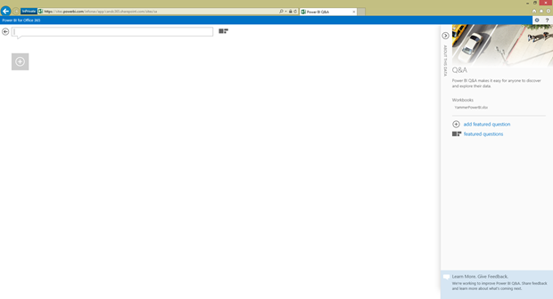
To use Q&A you click the option in your PowerBI site and you’ll see something like this below.
Notice that the UX is very ‘search’ like, this was done consciously by Microsoft to entice users to use Q&A like they would a search engine.
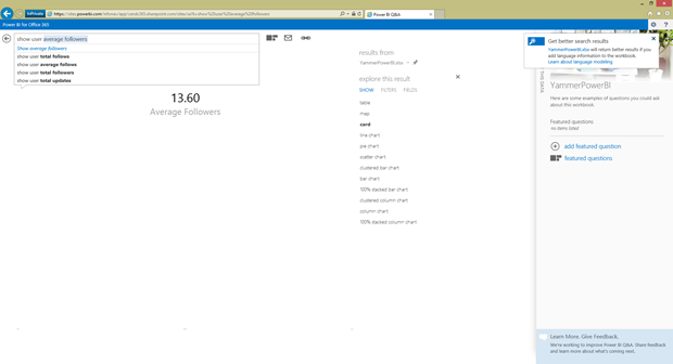
So after the user starts to type a question the Q&A begins to work its magic. Immediately it narrows down which data models it might be using. Notice the blue text below the query box is the ‘Restatement’, this is how Q&A is transforming your typed question and querying the data models. Also below that are query suggestions that Q&A thinks you might also be trying to perform.
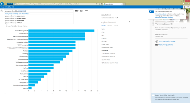
A really neat feature is the visual representation of the returned query is best guessed by Q&A to provide the user with what it considers the best display for the results. On top of this is can also apply filters, as you can see I’ve added a ordering to the query.
As you can see the filter pane is also available within the canvas for further filtering and settings.
The query box will also help the user because it greys out words which it can’t map to the data model.
Building models for Q&A
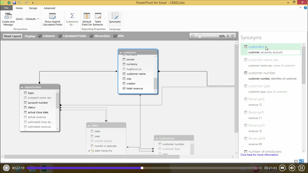
Sometimes there are things that just need some extra work to help Q&A assist the user. Things like naming conventions in the data model versus the naming the average business user uses. You can use ‘Synonyms’ in the data model to teach Q&A the other terms.
The formatting and modelling you use to drive Power View is also supporting Q&A providing a better experience.
- Use the correct data type for columns to help Q&A understand how to make the query to the model.
- Set up the ‘Default Field Set’ from the ‘Advanced’ ribbon. These settings determine which fields are brought onto the canvas in Power View and they also allow Q&A to display those fields when a user just types the name of the table.
- Set up the ‘Table Behaviour’ from the ‘Advanced’ ribbon. Setting the ‘Default Label’ allows Q&A to use the correct axis.
- Set up ‘Synonyms’ within the data model from the ‘Advanced’ ribbon.
Note: At the time of writing this feature only comes with the Office 365 Office version from your tenant software subscription.
Synonyms are displayed within a tool pane against your model. Within each field you can add other words which might be used while looking for that column in a comma delimited list. The first one listed is the ‘primary noun’ for that entity, this is what Q&A will use in the restatement (the blue text under the user entered query).
Sharing with Q&A
The first option is to simply copy the url, like most search experiences, once you enter a query the url reflects this query. Thus you can distribute this url to other to effectively reuse. If you think about this wider, imagine you are asked a question by a business user, you can now find the data via Q&A and help them jump in, and then further explore from that point.
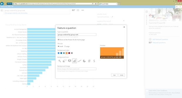
The second option is to add the question the ‘Featured Questions’ in the PowerBI site.
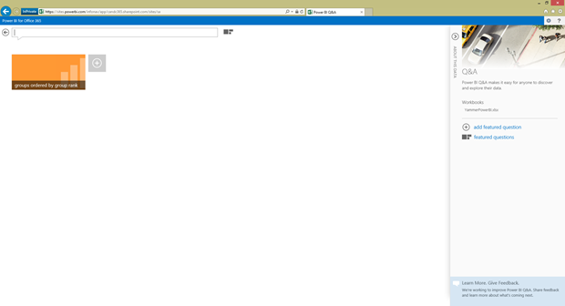
This allows you to setup various settings for the question before adding it, such as the question itself, whether to show it on the home screen, size and colour and finally and image. The image below is the home screen with the question added.
This image is of the Q&A screen with the question listed.
Behind the scenes in Q&A
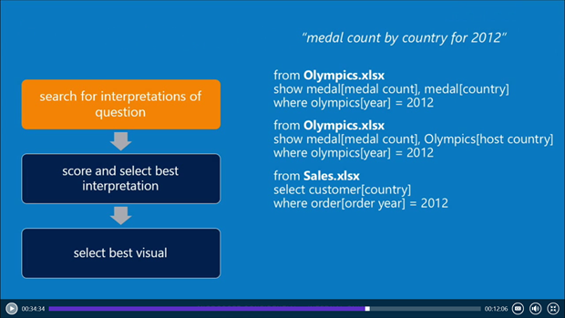
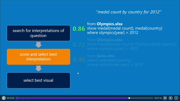
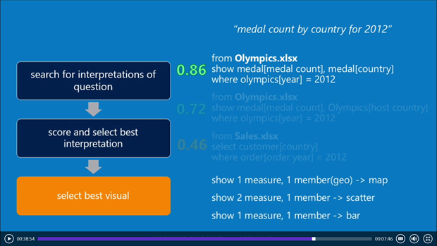
The overall steps are:
Search for interpretations of question – looking across all the workbooks enabled for Q&A and finding which ones could answer the question.
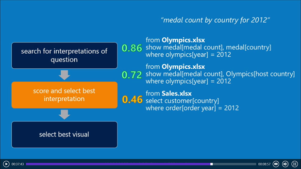
Score and select the best interpretation – ranking the workbooks answering capability.
This ‘Ranking’ means that Q&A will be using the top option.
Select best visual – determine which visual can explain the answer. This runs through a rules engine.
Influencing the best answer
Search for interpretations of question > Use data modelling and synonyms
Score and select best interpretation > workbooks in the site
Select best visual > data modelling (data types, data categories)
Data Management Gateway
The Data Management Gateway has three main capabilities:
- How can I enable corporate data feeds over OData
- How can I enable discovery in Power Query, enabling people to find data
- How can I refresh Excel Workbook data suing SharePoint Online
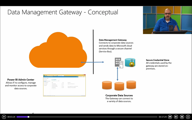
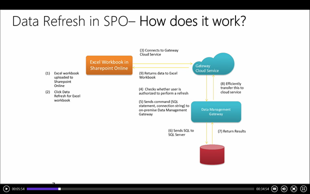
The conceptual layout for the Data Management Gateway is detailed in the diagram.
The Data Management Gateway sits in two places, one on-prem through a client and one online through PowerBI (PowerBI admin centre).
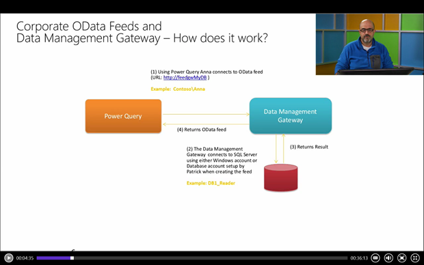
How does it work?
OData feeds through the Data Management Gateway
- Power Query requests data from the OData feed
- Data Management Gateway connects to the data source
- Results are returned to the Data Management Gateway
- The Data Management Gateway returns the data to Power Query
Data refresh
- Excel workbook is loaded into SharePoint
- Data refresh is called
- Connects to the Gateway Cloud service
- The Gateway Cloud service checks the users authorisation to perform a refresh
- If authorised sends the command to the on-prem Data Management Gateway
- Data Management Gateway sends the command to the data source
- The data source returns the results to the Data Management Gateway
- The results are transferred up to the Gateway Cloud service
- Returns the data to the Excel workbook
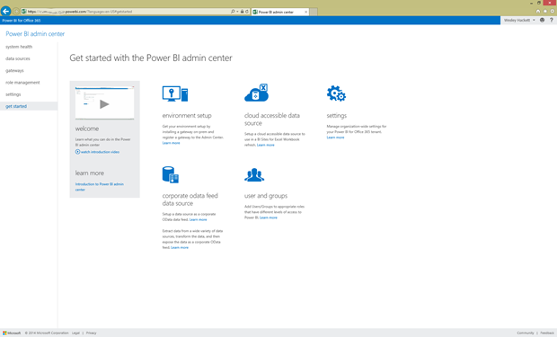
PowerBI Admin Centre
The admin centre provides the following:
- Allows you to install and monitor the Data Management Gateways for the organisation
- Configures access to the cloud enabled data sources
- Exposes OData feeds to the corporate data sources
- Configures the PowerBI user roles
You can access the Admin centre from either your tenant admin portal or directly via https://itadmin.clouddatahub.net
Interesting note, that the data source setup can be configured with either Windows or Database account. BUT you still need to add users to the datasource for them to actually access it.






May be useful for small amounts of departmental data but PowerBI is hardly a strategy for large organisations with big data. The current MS BI strategy is totally at odds with the previous on-prem based strategy in that it forces the CLIENT to be the main processing node.
That is OK, except that the typical enterprise desktop only has limited resources that are easily exhausted by PowerQuery and the Excel Data Model. Some of the enterprise data we might want to treat as BI runs to millions of entries, good luck getting that into Excel let alone into the DM and running a natural language query on it!
I’ve used PowerBI on and off since the closed beta and work in a large tech enterprise . We have data systems that process trillions of records daily and some that do more. I can tell you that PowerBI is a excellent tool for many departments including sales, management, security operations, finance, and even systems monitoring to a good degree. I feel there is a lot of uses for this tool, but it’s not a Big Data solution. It only does millions of rows at most. However for many cases, that’s more than good enough. These tools solve a lot of problems for a vast amount of people but there will always be many problems for which they aren’t well suited for.