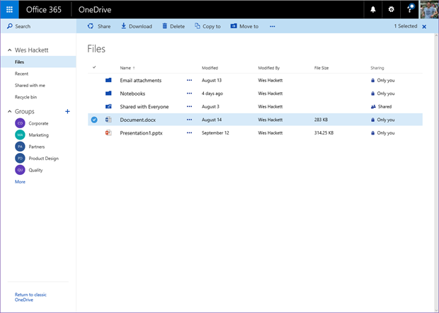
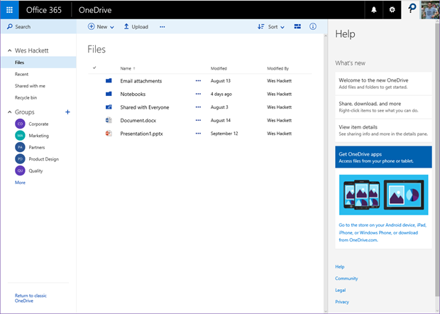
The eagle eyed amongst you will notice that Microsoft have released an update to the web interface of OneDrive for Business. It now looks and functions in a very similar way to the personal consumer version of OneDrive.
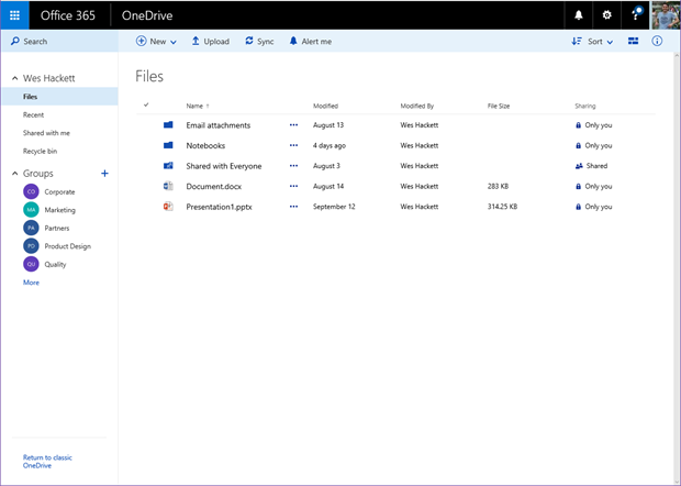
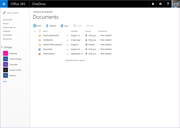
OneDrive for Business look and feel.
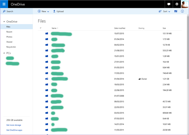
OneDrive consumer look and feel. (i’ve just redacted the names of my personal stuff, it doesn’t really have the blobs of colour all over it)
To me this feels like a great improvement in the user experience, and probably a good view an Office Fabric use. Microsoft did say that OneDrive for Business was utilising the Office Fabric. One challenge with this unification will be helping your employees to understand the differences, how to identify the UI so they understand where they are. I can already see some tricky consulting conversations ahead with regards the obvious questions around helping an employee differentiate one from the other. We always have to remember those of us living and breathing Office365 24/7 are actually not a ‘typical’ employee ![]() . The most obvious element is the ‘Office 365’ wording in the suitebar.
. The most obvious element is the ‘Office 365’ wording in the suitebar.
A tour of some of the features
Lets take a walk around the new features. While this isn’t an exhaustive list it should help get a footing.
View formats and options
We can switch between viewing formats with the following buttons in the action bar.
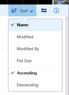
Sort is fairly self explanatory and changes the sorting of the main view.
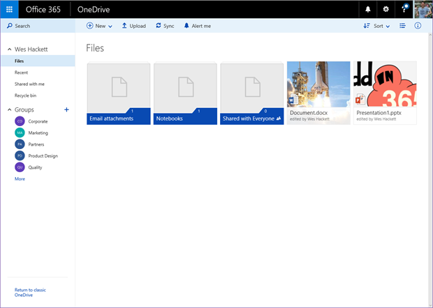
The little block icon next to it toggles the main view from details to icons.
Details view
Icons view
Document details
The ‘hover panel’ is no more. Personally i’m really glad to see the removal of the hover panel idea, it always felt clunky to me and was a really bad experience on a touch enabled device.
Selection of a document is now super easy even with a fingertip.
You can see the action bar become contextual with the common action now available for that file.
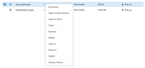
You can also invoked the menu from the item ‘…’ option as well.
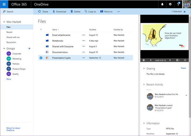
Opening the details panel now provides an in-depth view of the selected document. The file previewer for an Office Document shows the contents. If you select a folder you get the large folder preview icon and an item count for that folder.
Return to the older UI style
Simply click the bottom left
Which takes the view back to the older one.
Help panel
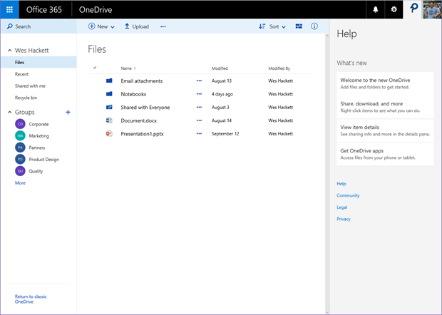
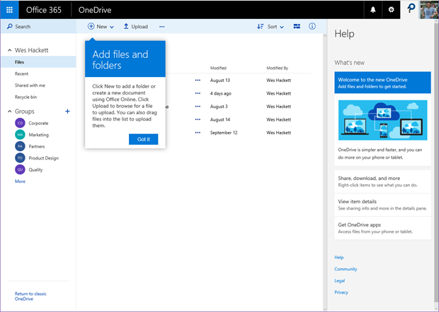
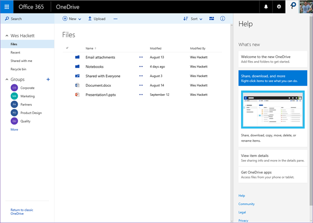
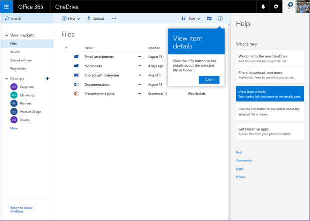
The new ‘Help’ panel also lights up with new content for this interface. Access it by clicking the ‘?’ icon on the suitebar. This is something that you can encourage employees to click through when they enter an area of Office 365 they are less familiar with. Microsoft are starting to bring some more useful and engaging information in through this mechanism and I’d encourage organisations to begin to highlight this feature as a good way to aid learning.
First item prompt.
Second item shows a small animation in the panel.
Third item prompt.
Fourth item prompt.
UserVoice
As you may be aware Microsoft like to hear from their consumer base about their changes and any ideas they might have via UserVoice. The specific OneDrive for Business is here: https://onedrive.uservoice.com/forums/262982-onedrive/category/86090-onedrive-for-business
Summing it all up
So these new user experience changes are great, one thing that struck me was no mention of them on the roadmap site http://success.office.com/en-us/roadmap.


