
Quick heads up about some SuiteBar improvements which are worth knowing about.
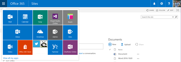
Microsoft have recently update the Office 365 SuiteBar. As you can see in the image below the Application Launcher got a new visual which resembles the Windows 10 Start experience. You can now resize the tiles as well as drag and drop them into a desired order. The tiles can be small like my Twitter and TinyPng or massive wide ones like my Delve.

Overall the SuiteBar has now become a responsive experience. It changes and adapts depending on the screen width and this removes the need for any clever work around.
Examples:
SuiteBar at a full 1920 width
![]()
SuiteBar a little smaller. Notice how the Application Launcher jumps to the right now.

Between the sizes above their seems to be a tiny glitch in about a ten pixel range where extra buttons appear.

The new buttons don’t do anything at this point though.
Finally we get down into the smaller mobile sizes.

I hope you found this update useful and it gives you chance to remove any customisations you might have made for the responsive SuiteBar.


Trackbacks/Pingbacks