
On May 4th we got an insight into the Future of SharePoint from Jeff Teper and team, you can read my event summary here: http://weshackett.com/2016/05/whats-new-with-sharepoint-microsofts-future-of-sharepoint-event-round-up/ In this article I outlined three areas of this series, this article falls within:
User Experience
Exploring the implications for organisations of the new UI and experiences being pushed into service.
During the Future of SharePoint event we saw the announcement of the new SharePoint Home experience. You can read more about the wider announcement about the ‘mobile, intelligent intranet’ from the Office Blogs. In the video Adam Harmetz, Group Program Manager, SharePoint experiences, talks about all the amazing new user experiences coming to SharePoint and Office 365. About 40 seconds into Adam’s video we get the first glimpse of the new SharePoint Home experience.
A little history
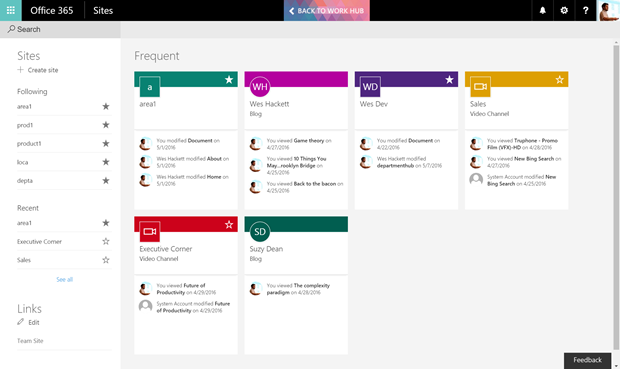
Since the launch of the SharePoint 2013 visuals on Office 365 back in 2013 we’ve had a page called ‘Sites’. This is a first level navigation item which appears in the Application Launcher. As you can see in the image below the ‘Sites’ page forms a key element of the SharePoint navigation experience. It provides a strip of corporate links along the top, your personally followed sites, recent sites you have visited, and finally sites that are recommended. The Office 365 version is slightly more advanced than the on premises version.

The Future
Today Microsoft began the rollout of the new SharePoint Home. First Release tenants will begin to get the new experience as it rolls out across the service globally.
Lets take a closer look.
The welcoming experience.
You employees are guided into their first use with the key elements being highlighted. As you can see in the image your employee is introduced to the ‘frequent’ strip of sites and groups.

Next up your employee is shown the value of ‘following’ and ‘recent’ sites and groups.

Next is explanation of the ‘links’ section.

The final section is the ‘suggested’ sites and groups.

After the intro you’re in and the new SharePoint page is there in all its new shiny glory. You can see in the image below the main content areas match the replaced ‘sites’ page. This is good from one aspect as employees will be familiar with the sites and groups listed within each area.

Cards
Let’s take a closer look at each of the visible card types.
The site card:
The site card is picking up the site logo or name abbreviation if the logo was the default SharePoint logo. It has the ability to be followed via the star in the header strip. The site title is also being displayed. There are also three items of activity being listed. This is giving you insights into activity within that site.

The blog card:
Delve blogs you write for or read are listed. Notice the lack of following ability on blogs, it’ll be really great if this feature gets added in at some point.

Video channel card:
Video channel displays the video activity in that channel. You can follow that channel from the card.

Now a couple of interesting observations. First this card colour matches the video channel selection which is a good thing. Second is that you can follow the channel on the SharePoint Home, but not from within the channel itself. This scenario needs to get closed within the Video portal, I think the user experience should be consistent between the pages. This would reinforce the value of following the content through both experiences. Seeing a page experience within the Video portal which is the ‘followed channels’ would be a good extension to an already good experience. Many customers use the Video portal channels to group videos into a context for employees, such as technical walkthroughs, news, community and product information. Allowing an employee to follow a channel and see that from both SharePoint Home and the Video portal consistently.

While we look at the cards, you’ll notice that they have colours that are seemingly random. The team site above is using the default blue and white SharePoint theme, yet appears green in the SharePoint Home. This will hopefully become joined up as the new Team Site user experiences and branding rolls out later this year. I’d certainly like to see consistency between the two. Often themes on collaboration sites are set by business unit or type of function and having this visual cue consistent between both would again be a cool addition.
With all the cards the clicking/tap launches the site/group/channel into a new tab. The activity line items provide a link to each document or video which launches into a new window. I think I’d still use Delve to get to my documents based in activity scenarios.
Seeing all your Following and Recent
So in a normal enterprise you will be following and visiting a largish number of sites and groups. It’s not unusual to have 20+ in your personal following. In the SharePoint Home you can view them all by clicking the ‘see all’ link in the left hand menu.

The discoverability of this was not as clear as I think it could be. For me the ‘see all’ is visually associated to the ‘recent’ section so it took a few clicks to discover that it also showed all my ‘followed’ sites. Personally I’d like to see either the headings become clickable or a better information scent for each section, even if it just links to a bookmark of the section in the unified listing experience. As you can see from the image below this page from the ‘see all’ link lists all the sites I’m following.

The ‘recent’ section appears below the ‘followed’ section as you can see in this image.

This page doesn’t list out the activity within each site. I’m guessing there would be a pretty huge performance implication if every card was to display the activity list. Is this missing some of the value though? Should this be a place you can see activity across every site you follow. The Office Graph is driving a lot underneath, maybe there will be some exploration by Microsoft in bringing an activity addition to these cards as well. Although does this begin to clash with and dilute the value of Delve as an experience? I know customers are already asking about the search in the SharePoint Home they’ve seen in the videos and how Delve fits into this story. Delve is already an awesome experience and in many peoples opinion solves that ‘Goggle like’ search experience that we’ve been asked for for years. The way it can predict what you might be looking for before you search is proving to be of huge value in high performance organisation cultures for many customers. Is SharePoint now competing with Delve? The SharePoint Mobile app is also gaining document and site searching, the Delve app can do the same. Where and when will this become clear? Lets hope this gets addressed soon.
There also is no obvious back link on this page so I’m relying on the browser back to navigate.
Search
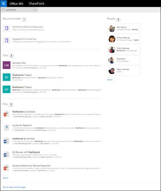
The existing ‘sites’ page provides search, the new SharePoint Home also allows a search experience.
The search box has a type-ahead feature as you can see below.

Typing something in like ‘exec’ in this example and you get this.

Clicking on ‘see all’ gives us an extended page.

At the time of writing my tenants weren’t showing the full experience Microsoft published via their support article. I’m assuming this is still rolling out behind the scenes.
You can switch back into the SharePoint search center clicking the link to ‘go to classic results page’. This auto switch isn’t remembered and has to be invoked each time. Another consideration here is that if you’ve invested in configuring and tuning your SharePoint search experience this new page is getting in the way between your initial search and the configured one. Possibly something to consider and feedback to Microsoft on.
Just for comparison lets look at the same ‘exec’ search in Delve.

Personally I would stick to using Delve for my initial search as it just provides a more useful experience for my working patterns. Board and Yammer features just add the value I need during a discovery scenario.
Links
The links are managed in the same way as before through the page if you are an admin or via the SharePoint Profile service in tenant admin.
Putting the links into edit mode

Adding a new link is simple

New site
Finally there is the ‘new site’ link, which still launches the existing SharePoint create new experience. We’ll see the new provisioning interface later when the new team sites arrive I guess. Still plenty of value to be had from your PnP provisioning investments, but plan for how this change will impact you.
Summing it up
So it’s a big improvement to the ‘sites’ experience. As with everything first release it’s not perfect, or complete, but jumping into User Voice https://sharepoint.uservoice.com/ and sharing ideas, improvements and new features will help the team get more from the service.
You can read the official support information here: https://support.office.com/en-us/article/Find-sites-and-portals-in-Office-365-6b85097a-87e0-4611-a29a-dfd49b1a1220?ui=en-US&rs=en-US&ad=US which is a good place to start to understand the mechanics of how to configure the page and the information available.
Dealing with this change inside your organisation also needs some considerations. Start to prepare you internal communications team to publise these features. Key highlights should include:
- Reassuring employees that existing data reminds the same and that the experience is additive
- Explaining the features and how they support working scenarios
- Explaining the options with Office 365 for searching and which is appropriate in certain scenarios
I hope you found this info useful and onwards to the Future of SharePoint


Hi. Regarding the results described in the support message not showing up in the searchpage, its probably because you dont have any hits for people, sites an recommended results for the ‘exec’ query. If you do another search for i.e a person in your tenant, they should appears as person results.